AZI PORTFOLIO

PORTFOLIO AZI
I’m Azi. Born and raised in the Philippines. Oakland, CA–based since 2019. Davis, CA–based since 2025.
I’m in love with all things art—drawing, music, videography, photography, and acting. But right now, I’m especially in love with graphic design. So much so that I’m going to school for it.
AZI JAO
Art Maker
Graphic Design


SELF-PORTRAIT CD MOCKUP: THE SOUNDTRACK OF MY LIFE
Growing up in a musical household, I’ve developed an (expensive) hobby of collecting CDs. Besides the music, I’ve also enjoyed staring endlessly at my favorite album’s cover art. So, I wanted to portray myself and my life in a way that is outside traditional self-portraits.
This is one of my most personal works, with the tracklists summarizing monumental moments of my life, and the CD title, “GET IT DONE,” serving as my ultimate motto: get things done, no matter what.
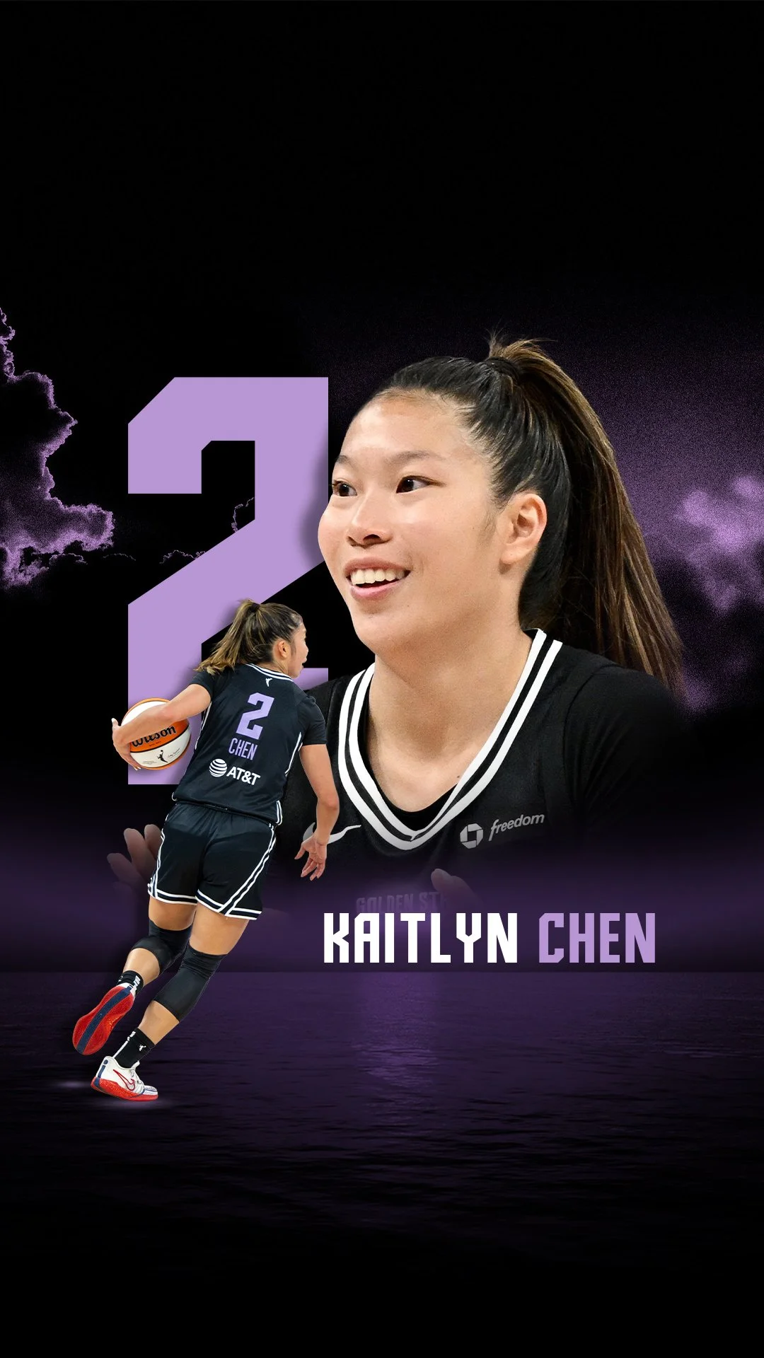
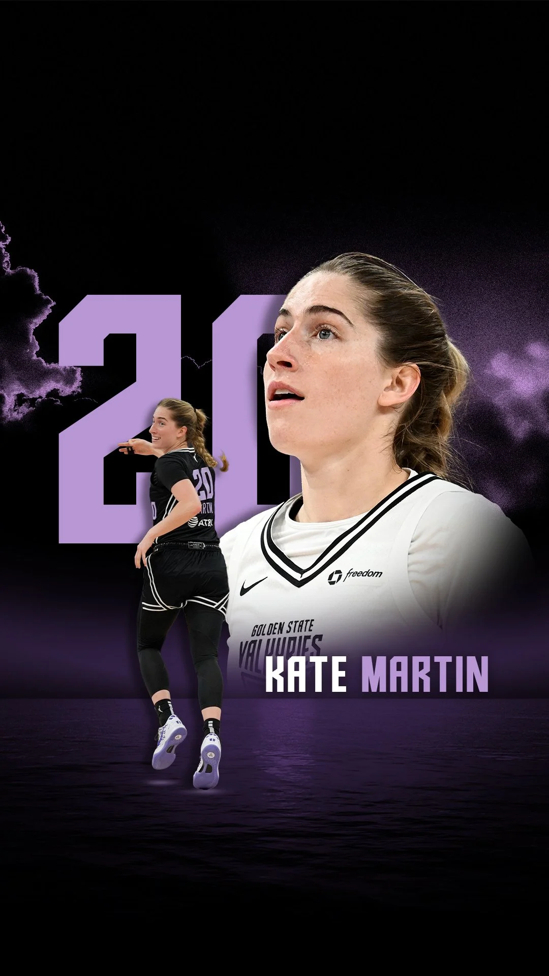
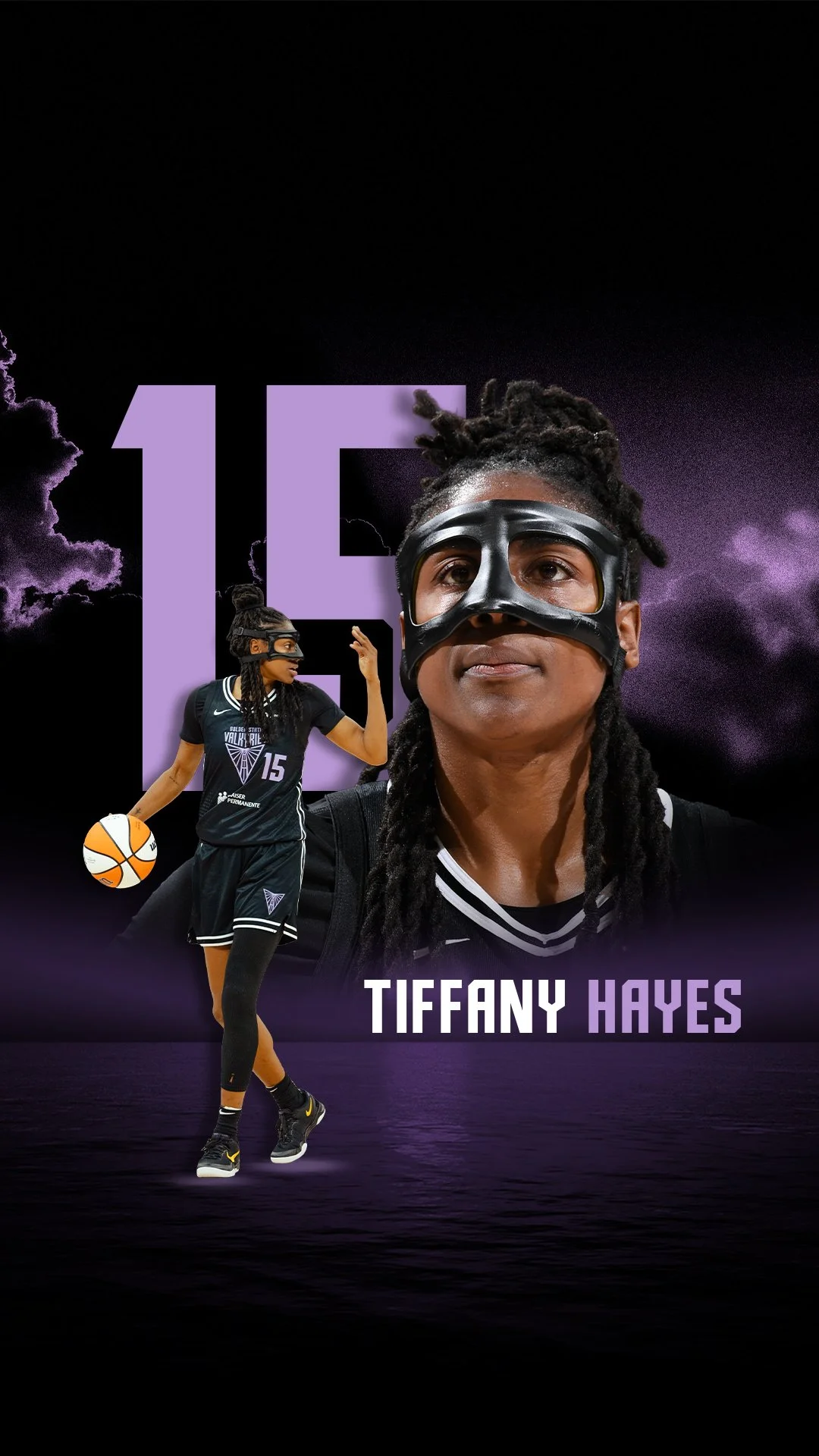
Sports Design
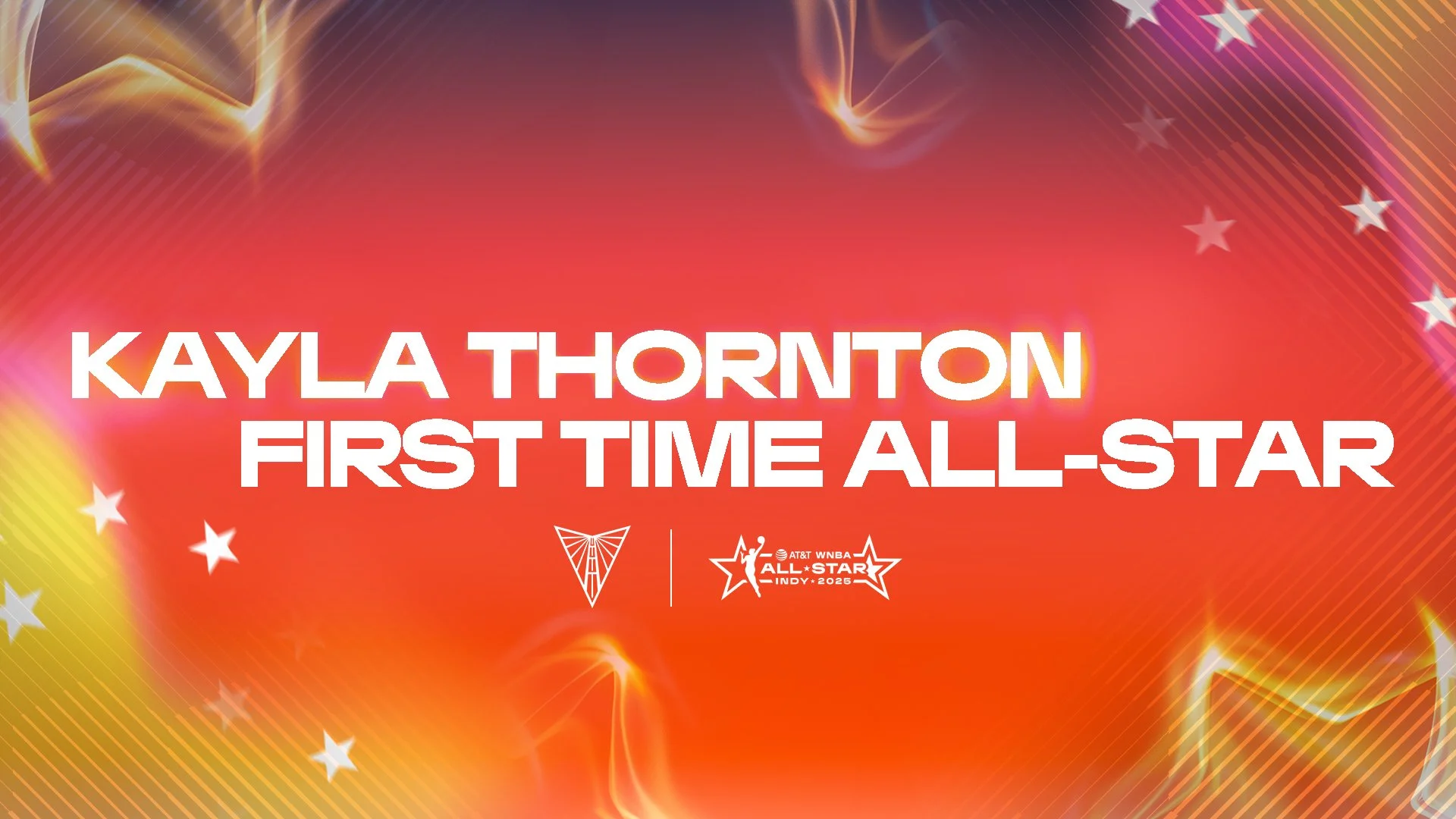
Below are some of the projects I worked on during my 2025 summer graphic design internship with the Golden State Valkyries.
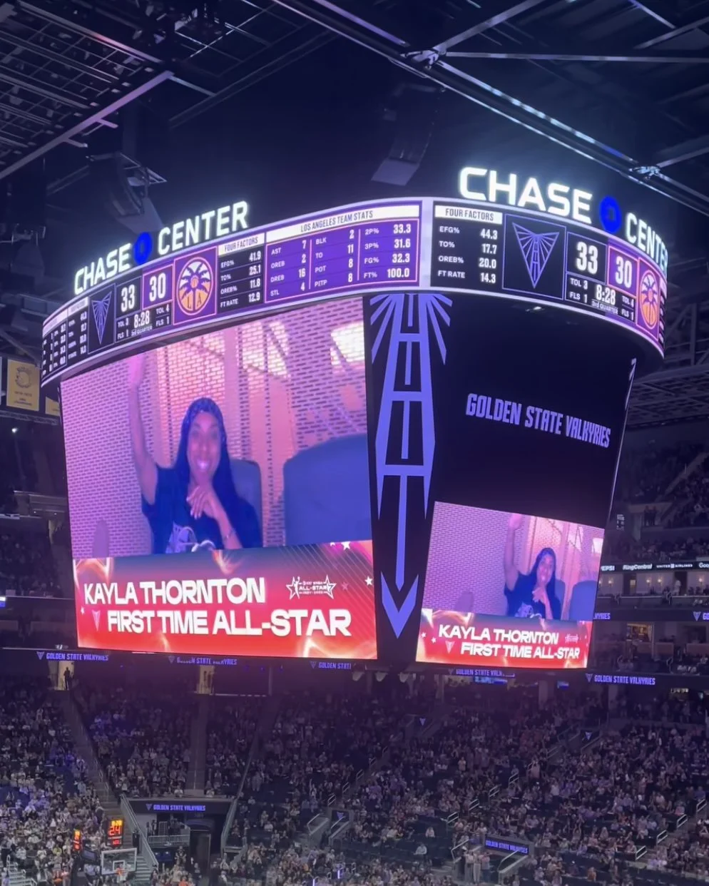
Graphics Honoring Kayla Thornton’s First Time All-Star Participation
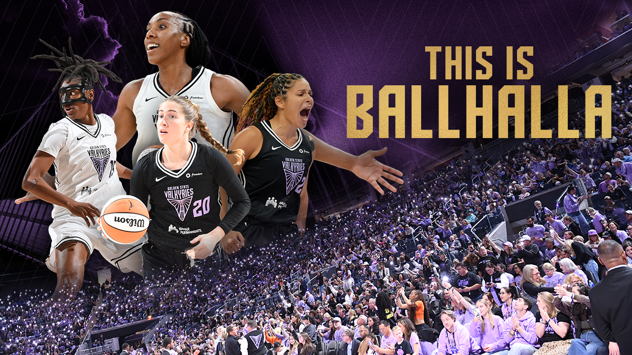
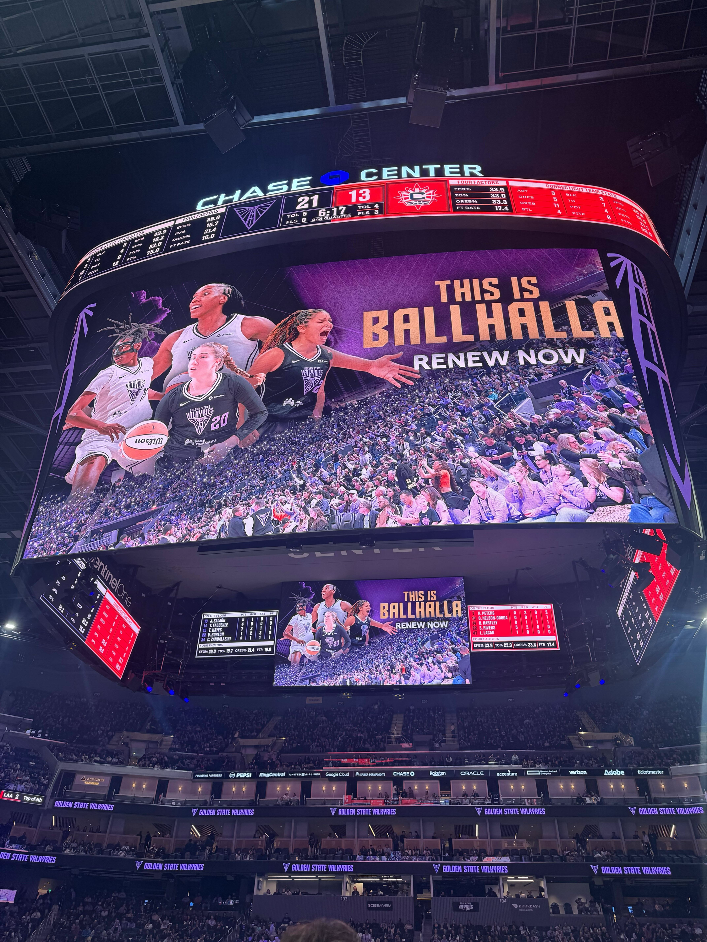
Graphics for the Golden State Valkyries Season Ticket Renewal Campaign
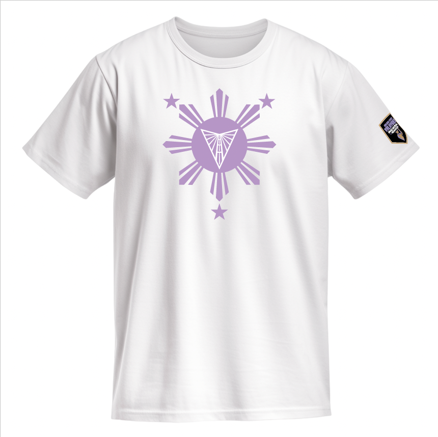
T-Shirt Design Exploration for Filipino Heritage Night 2025

“Wallpaper Wednesdays“ Promo for Adobe Express
Coursework
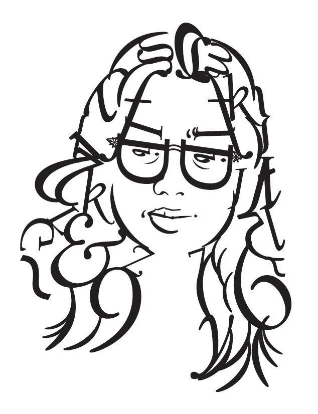
Type Self-Portrait (Fall 2025)
DES16 - Graphic Design and Computer Technology
Creating this self-portrait with type involved a constant decision-making process, going back and forth on which letter and typeface would best form specific lines and contours of my face. An actual photo of me was used as a reference.
Working with serif typefaces was easier compared to sans-serif ones, as their silhouettes were more organic, perfect for the irregular lines and shapes of human hair and facial features.
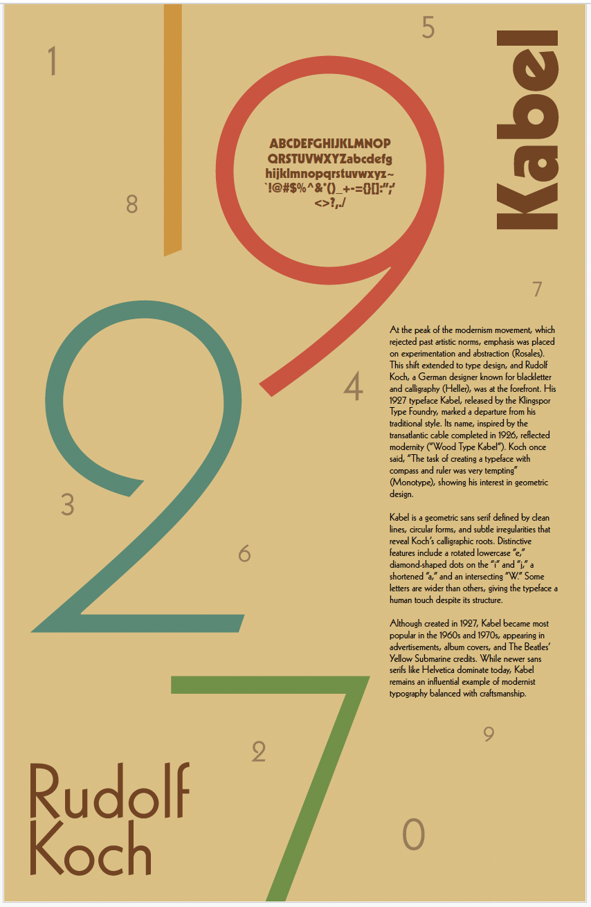
Kabel Poster (Fall 2025)
DES16 - Graphic Design and Computer Technology
This was a typography poster exercise where we had to showcase a typeface’s unique features along with its history, and I chose Kabel. For my piece, I wanted to emphasize the shape of the number 2, so I made the year Kabel was created the largest element.
Although Kabel was created in the late 1920s, it was widely used throughout the 1960s and 1970s, which inspired the color palette.
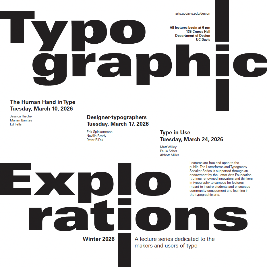
Type Hierarchy Project
(Fall 2025)
DES115 - Letterforms and Typography
In this project, we were tasked with exploring hierarchy within typography to emphasize certain information. For a conceptual event, I decided to make the title the largest element. I also paid attention to the shapes the title was forming, which led to the line motif in the “i” and “l.”
I noticed the direction the title was moving, so I continued that staircase or staggered movement in the body copy.
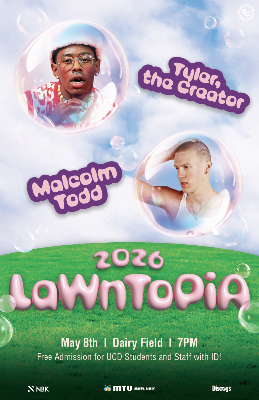
Lawntopia Poster Concept (Fall 2025)
DES16 - Graphic Design and Computer Technology
For this class’s final project, we were tasked with creating a poster for an event of our choosing, and I chose UC Davis’s annual Spring quarter concert, Lawntopia.
Since the event takes place in the spring, I wanted to create a sunny, bright vibe, so I led with a “bubblegum pop” concept. This concept allowed me to be intentional with the colors, imagery, type treatment, and textures I chose.
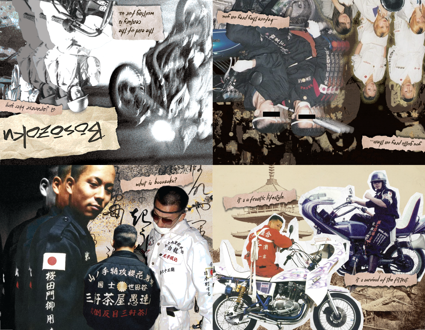
Bōsōzoku Zine
DES16 - Graphic Design and Computer Technology
For one of our projects, we were tasked with creating a zine on a topic of our choosing. I chose to focus on a Japanese biker gang called Bōsōzoku. After watching documentaries and reading about the group, I learned that they were loud and unorganized-yet-organized, and I wanted to reflect that energy in my zine.
With this in mind, I led with a grunge, collage-inspired theme featuring lots of textures, layers, and noise, while organizing the layout in a way that clearly showcased what members looked like.
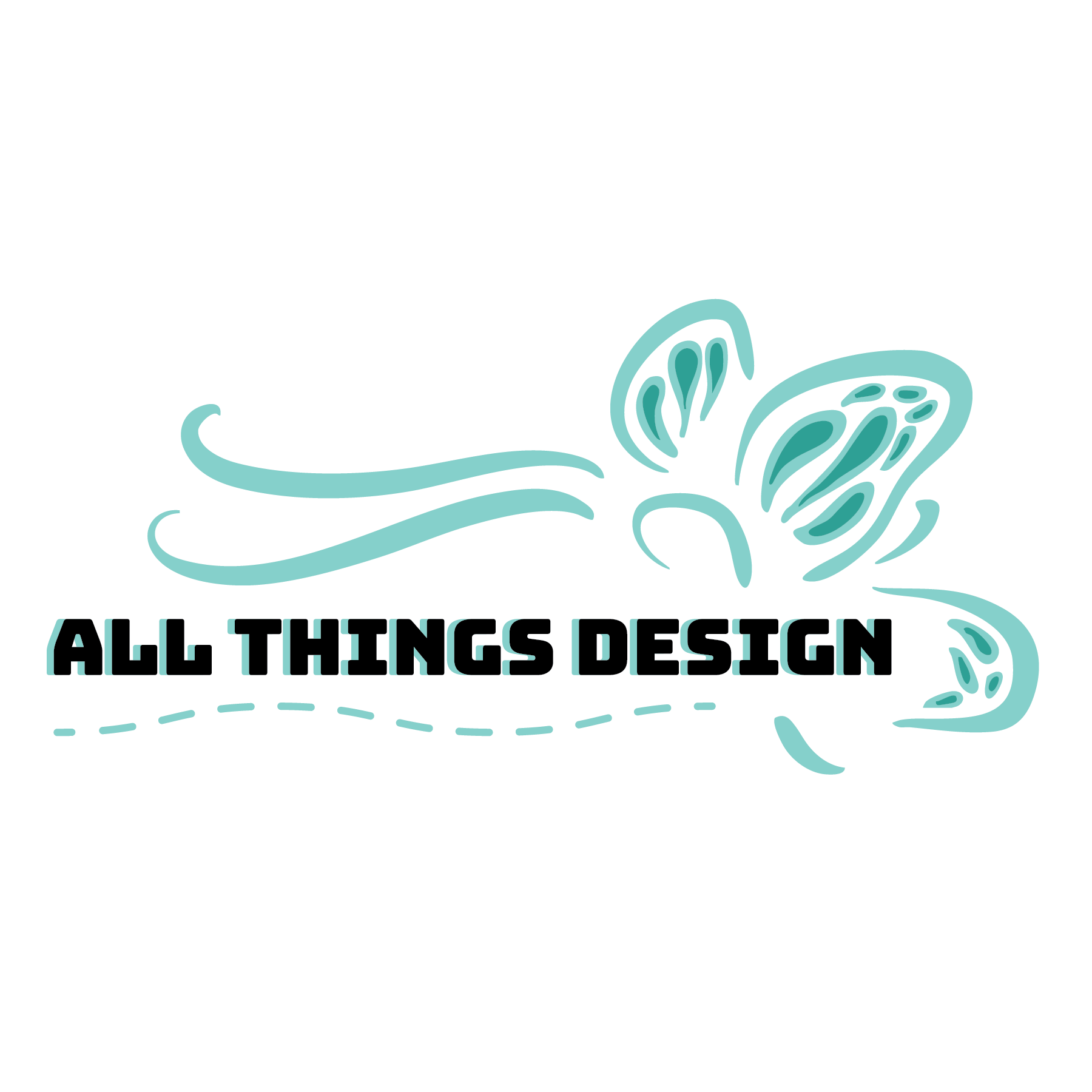
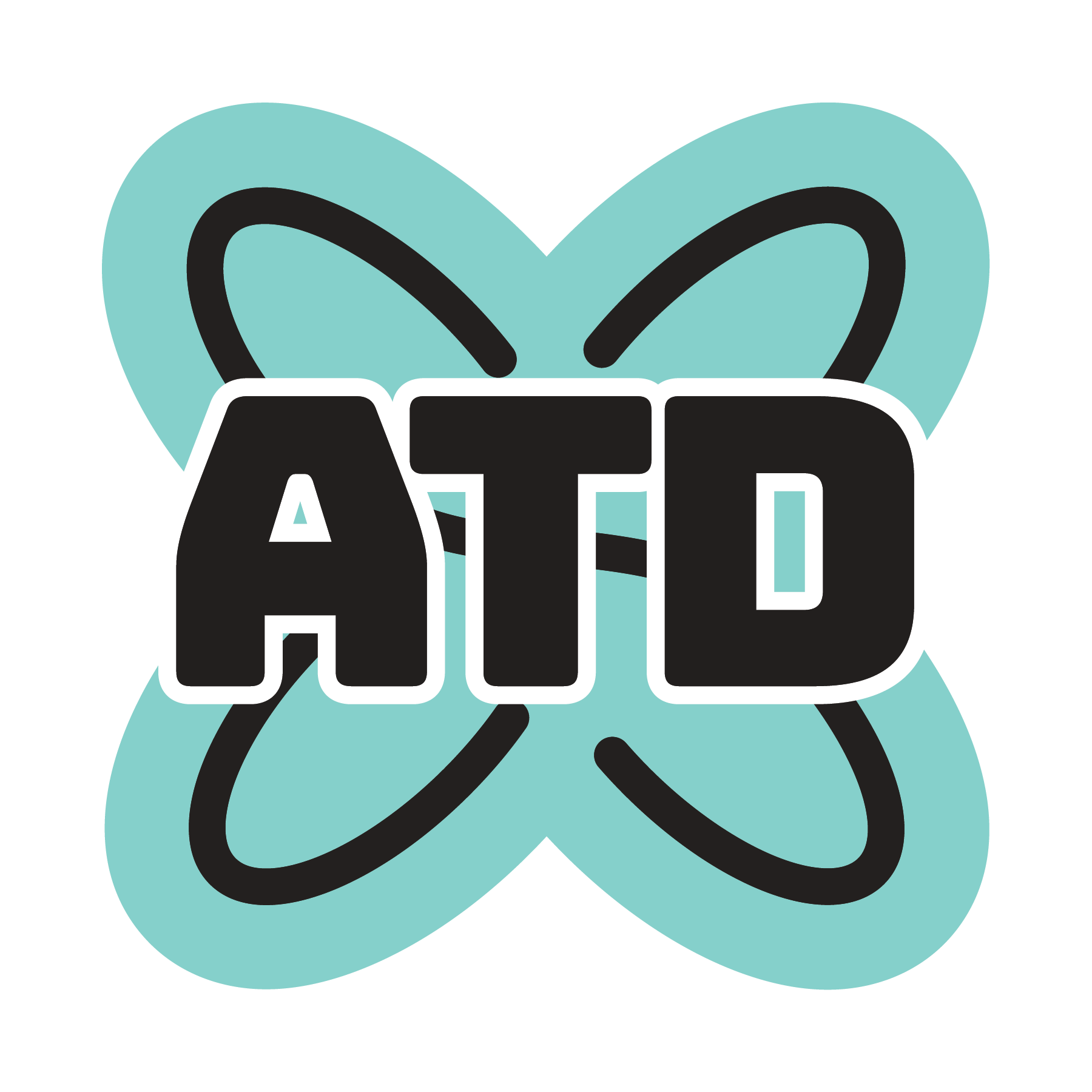
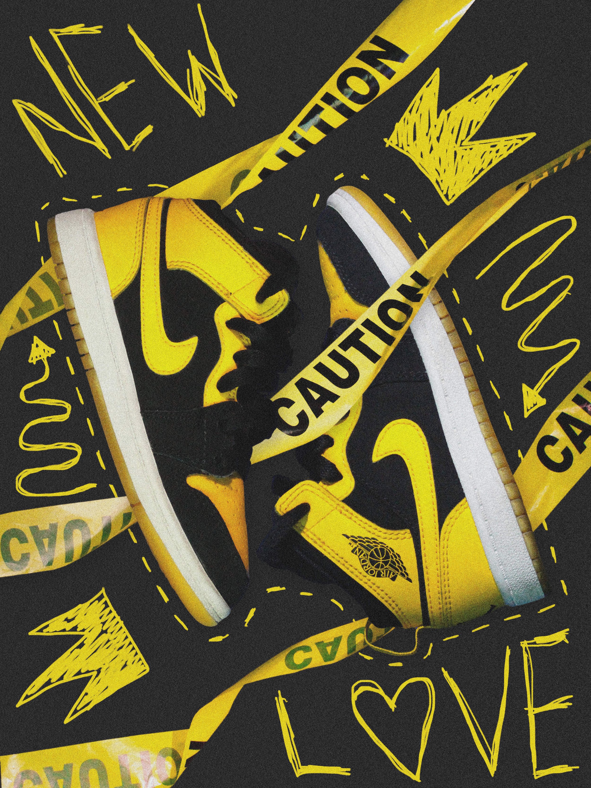
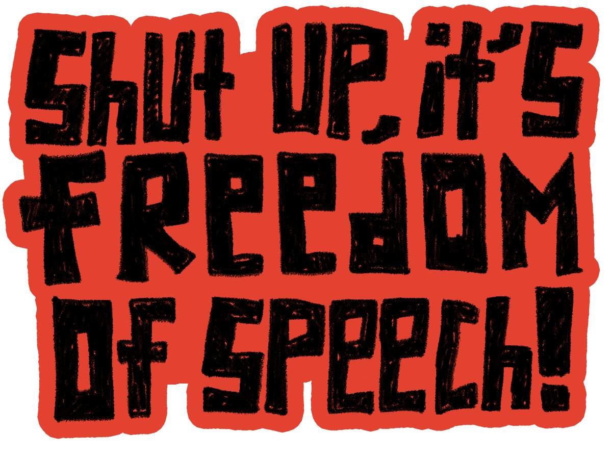
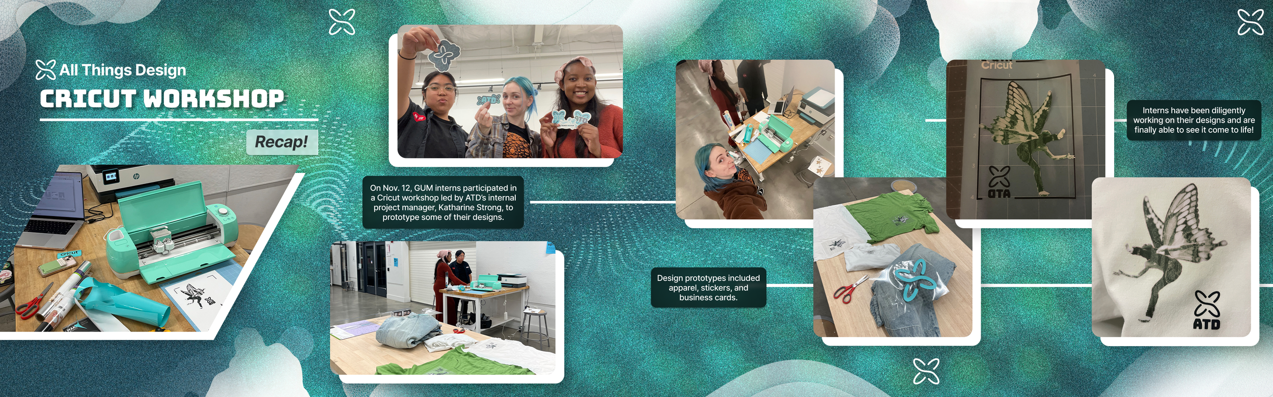
All Things Design (ATD)
As part of the graphics team in my college’s student-run design agency and club, I worked on various projects ranging from digital to print while helping develop ATD’s brand identity.
ATD Instagram Posts (Figma and Photoshop)
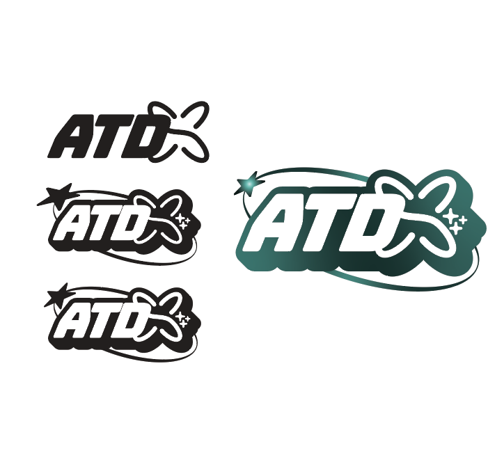
Sticker Designs for ATD Merch